choci
brand design · desktop UI · university project · 2021
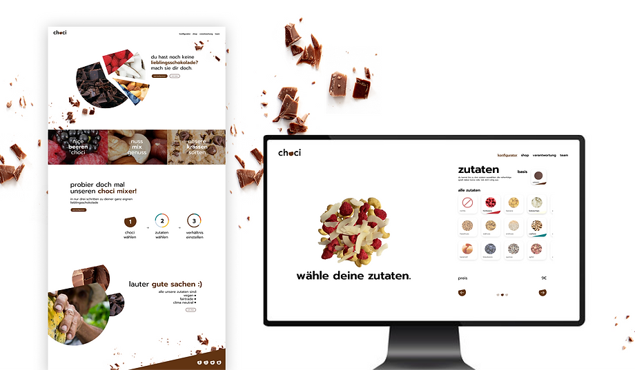
choci is the new delicious chocolate brand, now available in your local supermarket. Create your very own chocolate bar with just a few clicks and get your chocolate delivered to your door - truely a well-rounded experience.
Goal
During this project, my team set out to create a complete branding experience. Following a brand design sprint, we worked to help our fictional start-up realize its full potential.
Tools: Figma, Photoshop, Illustrator
Team: 3 students
Time budget: 1 semester course


Lovable Responsible
Ingenious
Let's define our brand
Choci is different to other chocolate brands but how? And how can we communicate this to customers?
First we asked ourselves what competences, personality, visions choci wants to convey and worked ourselves up to our brand core values and message. This would be the basis for our design process.

Logo
choci needed a logo that's recognizable, but could also easily be used across many different use cases. We might expand our brand to different products, use the logo for our website or for merch.

Font
Font and logo were developed in parallel. What font is lovable responsible and ingenious at the same time? Hm... In the end we decided on the friendly sans-serife font "prompt" that has just the right amount of character.

Brand Colors
Our brand colors rely on a clean black and white look with a warm chocolate brown that nudges you to take a look in your cupboard in search for a snack.

Additional Colors
We decided to sprinkle in some pops of colors into our friendly but simple designs. The bright colors stand for the many different bursts of flavors that choci brings with individually added ingredients.
Design Elements
A toolkit for choci designs
After finalizing the logo, fonts, and colors, we developed design elements and strategies to support future design work, helping create a consistent and unique experience that makes choci feel both familiar and trustworthy.

choci dot
This cheeky dot from our logo can be hidden in icons, buttons or turn up in graphics.

choci yum
Who doesnt like to look at freshly chopped chocolate, a pile of berries a splash of honey?

choci corner
At choci we prefere all things round. But when life gives you corners? Turn them choci brown.

hidden choci
We like to play with what we show and what stays hidden. (Usually, the things we hide are tasty.)

choci circle
Every delishious ingredient has a fun color. How much strawberry is in this? Let's take a look at the choci circle.

mini font
You know it's choci when only the lower case letters are invited to the party. Our font is a rebel.
Touch Points
And this is what the choci brand experience could look like when you encounter it across different contexts. Does it feel lovable, responsible and ingenious?


Website Design
Okay great, now we're all hungry. So why not visit the choci web-store and get your hands on your favorite snack by creating your own unique chocolate?